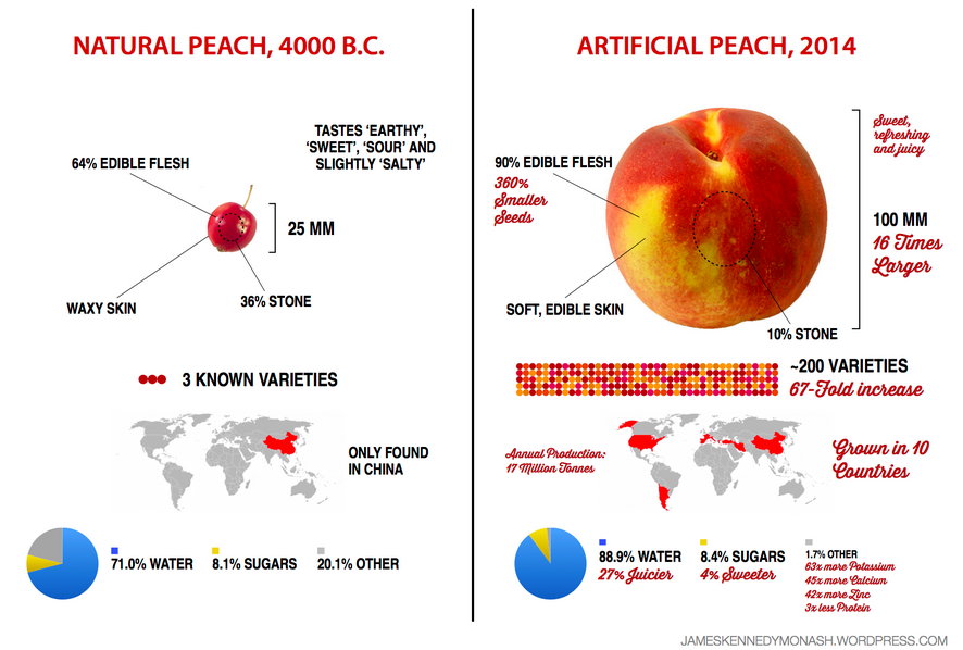
Great graphic from James Kennedy (@VCEasy) comparing natural & artificial peaches.
Interesting infographical look at how a few thousand years of human intervention can result in a deliciously juicy summer treat. Most interesting? The percentage of sugar a peach holds has not gone up that much, only the edible flesh ratio and percent water have.
I should add that in this graphic, “artificial” just means that the modern peach was artificially selected by farmers who chose which variants to propagate, as opposed to being subject to the unguided processes of natural selection. I worry about the misconception that “artificial” here might be misconstrued into meaning “inferior” or “dangerous” or “fake”. It is none of those things.
Don’t fear the fruits of science. Especially the juicy ones.
(Breaking down the chemical fear and overuse of scare quotes that surround the “natural vs. artificial” food movement is the whole point of James Kennedy’s infographics, like his famous list of ingredients in an all-natural banana, I just want to make sure that it comes across to people not familiar with his work!)
A lovely infographic for a lovely fru–*sees greyed-out Canada* Wait, what? That’s definitely not right. I have personally eaten Canadian peaches.
Ah, if you click on the link in the OP, you’ll find Kennedy has replaced this version of the infographic with a corrected one. Much better.
Tags:
#the power of science #food #yummies #our home and cherished land #I only just discovered the joys of stonefruits last year #oh nectarines #where have you been all my life

