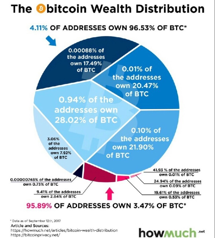
Shattered distribution.
i’m sorry i understand this is trying to make a point but literally all i can think is “what the shit kind of graphic design is this”
Recently, I had a practice exercise for Critical Thinking class (Unit 7: How to Lie with Statistics) in which I had to find a terrible graph in a news source and explain why it was terrible.
As such, my reaction to this post is “*sigh* howmuch.net is at it again”.
(In the case of the post I linked, the article was even worse than the graph taken in isolation. Fun fact: as far as I can tell (and admittedly it’s not all that clear), the original data source uses “housing” to mean everything involved in maintaining a residence (such as utilities), but the article strongly implies that “housing” = “rent”. And they casually assume that a household with average income will also have average expenses, and at one point actually conflate income and expenses!)
—
On the bright side, the OP is wtf-viz, which means that the point this post is trying to make is “what the shit kind of graphic design is this”.
Side note, a lot of the high concentration of bitcoin ownership in a handful of accounts is due to the fact that early in the history of bitcoin, when bitcoin mining was really easy but bitcoin was not very valuable, a number of people mined a lot of bitcoin but then left the network presumably losing the private key for their wallet.
Tags:
#(October 2017) #conversational aglets #adventures in human capitalism #embarrassment squick


One thought on “”