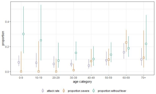
CJ and I were trying to find the proportion of severe cases in Shenzhen by age in this horrible little paper (me, after failing to find the pertinent information after looking at all the important looking graphs: maybe it’s time to read the wall of text. / CJ: I have a better idea. Let’s buy plane tickets to China, find the authors, then murder them.)
At the end, we’ve ‘found’ the right figure for the 30-39 range (The only age range with non-zero severe case proportion under age 40) by… using the screencap tool to measure how many pixels the center of the yellow square at 30-39 is from the bottom, and then measuring how many pixels are between the 0 line and the 0.1 line, and determining that 7 pixels over 53 ~= 0.13, so the fraction of severe cases for that age is 0.1*0.13.
Civilization is maddening!
Tags:
#anything that makes me laugh this much deserves a reblog #illness tw #covid19 #fun with statistics #death tw? #murder cw?
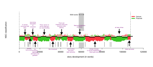
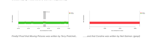
This is fascinating, and from what I remember pretty accurate (although the opening, which is primarily green, is so evenly split it should be some kind of chequer-board). What’s mostly interesting is how little there is that’s pure red or pure green, which is how I remember it. Christmas, as they say in New Mexico, in answer to the State Question. It’s also why we were so unimpressed by anyone who thought they could tell us who wrote what, because when they cited things, they were mostly wrong.
Using a training set of texts by Pratchett and Gaiman, I used the R package Stylo to analyze Good Omens. (Specifically rolling nsc classification with 50 features and 5000 words per slice). The figure below shows my results. The words of the novel progress along the x axis. The pattern below the horizontal white line represents the signal from the author to whom the program attributed the majority of the authorship (Gaiman is in red and Pratchett is in green). The top, fainter pattern roughly shows how much signal there is from the other author. Together they add up to 100% in each section of the text.
I was amused to see a tiny sprinkling of me in Moving Pictures. Because there was a sprinkling of me in there. Terry would send me the book as he was writing it, and call to bounce ideas off me, and I’d cheerfully suggest lines and ideas. (There’s a sprinkling of me in Guards! Guards! and Moving Pictures, with a lot of me in Pyramids and Eric.)
A scientific study of probability in the D&D universe would reveal some pretty wild shit and I don’t know why more in-universe mathematicians and scientists aren’t talking about it “Yeah, it turns out that no matter what you attempt there’s a fixed probability of success and it’s some multiple of 5%, or in a few cases a fixed probability that’s as if it were the combination of two such probabilities, for instance for subjects of the spell Enhance Ability, any task that could conceivably result in failure seems to do so at least 5% of the time. You’ll laugh when I say this, but it’s almost as if the celestial beings that control the whims of fate are rolling, and I know how weird this sounds, twenty sided dice. Not real dice of course, they’re an analogy for some undoubtedly process we know nothing about”
That’d be a yes. Mind you, this is pretty minimal in comparison to the jump that happened for LiveJournal:
I do think it’s highly likely that there will still be a significant portion of fandoms and users still on Tumblr for several more months- the same thing happened to LiveJournal prior to the data above, where a large spike was seen in July 2012. But movement is happening and it’s good to be aware that it is.
#this doesn’t even count me #I’ve had a DW account for ages I just only used it for commenting #Dreamwidth #The Great Tumblr Apocalypse #The Last Tumblr Apocalypse #fun with statistics
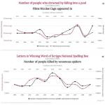
These charts were made to depict that correlation does not always equal causation, showing that although statistics always arise, they aren’t always necessarily useful.
Tags:
#fun with statistics #this probably deserves some warning tag but I am not sure what
I do this too! Since my post-2012 appetite is pretty good at adjusting for the calorie density of my food, the intuitive unit for “how *big* is this food relative to other foods” is the kcal. (Which runs into problems when I’m trying to figure out relative food prices *in general*, because Mom’s intuitive appetite unit is the “serving” (whatever *that* means) and Dad’s is the “millilitre”, so we sometimes can’t even agree on whether one piece of food is bigger than another. But as long as I focus on only my own eating I can get a good sense of it.)
A lot of things turn out to be cheaper than they look because of high calorie-density. I was especially surprised by peanut butter: I figured it would be *somewhat* on the cheap side, but it’s as cheap as ramen. (In my own circumstances, that is; I notice your figure for ramen is higher than mine, if I moved the decimal places right (I work with “cents to two decimal places”). Both peanut butter and ramen were 0.06 cents/kcal.)
Tags:
#food #adventures in human capitalism #reply via reblog #disordered eating #(I’m okay but I expect people blocking that tag do not want to read this)
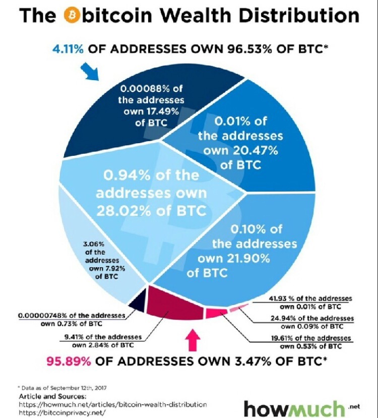
i’m sorry i understand this is trying to make a point but literally all i can think is “what the shit kind of graphic design is this”
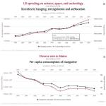
Recently, I had a practice exercise for Critical Thinking class (Unit 7: How to Lie with Statistics) in which I had to find a terrible graph in a news source and explain why it was terrible.
As such, my reaction to this post is “*sigh* howmuch.net is at it again”.
(In the case of the post I linked, the article was even worse than the graph taken in isolation. Fun fact: as far as I can tell (and admittedly it’s not all that clear), the original data source uses “housing” to mean everything involved in maintaining a residence (such as utilities), but the article strongly implies that “housing” = “rent”. And they casually assume that a household with average income will also have average expenses, and at one point actually conflate income and expenses!)
—
On the bright side, the OP is wtf-viz, which means that the point this post is trying to make is “what the shit kind of graphic design is this”.
Tags:
#adventures in University Land #reply via reblog #adventures in human capitalism #(tangentially)
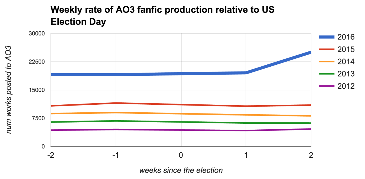
TOASTYSTATS: Did the US election influence fanfic production?
I’ve heard some folks talking about using fanfic to cope with/distract themselves from the recent US election (I’m in this camp, though I’m not ignoring the real world), and others, like the hosts of @fansplaining, discuss not being able to focus on fandom right now. I wondered which of these impulses was currently stronger overall in fandom.
TL;DR: as of two weeks following the 2016 election, there’s been a big post-election spike in fanfic production on AO3 (~30% increase) – which is unusual for this time of year. Though, of course, correlation is not causation – there could be some other cause(s) at play. And while some people may be turning to fandom for distraction, there’s a bigger increase in ‘Angst’ than ‘Fluff.’
I gathered daily data from AO3 for the pat 5 years in order to compare this year to past ones. I figured even if we did see a spike or a drop in fanworks, that might be normal following an election – or just normal for November. The past 5 years have the benefit of containing another presidential election, as well as a midterm election and two off-years. I looked at the total amount of fanworks produced in each of the two weeks leading up to the US election, and in each of the two weeks following it. (If you look at the above graph, 0 on the x axis is Election Day – Nov 8, 2016.)
Based on the above graph, we can see that most years have a fairly flat production rate surrounding the election. 2016, however, departs strongly from this pattern with a 32% increase from the two weeks leading up to the election.