AmoeBAND became a 2012 IDEA Award Finalist by innovating every possible aspect of the plaster (band aid).
The design revisions were:
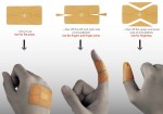
– Strategic cut-outs shape to fit fingers in such a way that it is easy to bend them and not disrupt the bandage.
– An intelligent dressing material allows you to regularly check wounds from the outside, without upsetting the healing process.“According to research, the when an infection of a wound is detected, the pH value is between 6.5 and 8.5. AmoeBAND’s indicator cross turns purple, alerting the user needs to change it immediately.”
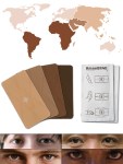
– Since the bandage material used exudes a leather-like feel, availability in different skin-tones helps it blend in, without overly highlighting the injury.
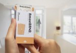
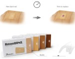
– The packaging has been redesigned to a matchbox style and includes Braille instructions.
Hat tip to designers Tay Pek-Khai, Hsu Hao-Ming, Tsai Cheng-Yu, Chen Kuei-Yuan, Chen Yi-Ting, Lai Jen-Hao, Ho Chia-Ying, Chen Ying-shan, Weng Yu-Ching, and Chung Kuo-Ting
it’s always funny when people improve on something and you look at the innovations and it’s like so fucking obvious what needed to be changed, but yet no one seemingly thought of it until then, yourself included
Ah, it’s been a while since the last time I saw this post going around. Still wondering when/if it’s actually going to come to market. Still wondering why they’re not emerald green.
(Is it somehow embarrassing to be obviously wearing a bandage? Why are only little kids allowed decorative ones? And if for some reason you don’t want decorative ones, there are already bandages out there that are transparent, which seems like a better solution than just having several shades of one-size-fits-no-one skin tones.)
Tags:
#bandages #the current ‘vague beige’ is so unlike pale skin #that the only way you can tell it was *meant* to be like pale skin is through the way it clashes even *more* with dark skin #embrace the clash or don’t have a colour at all
